“How can I express who I am through symbolic imagery & color?”
We asked and tried to answer questions like;
"Who is this person?"
"What do they do for a living?"
"How old are they?"
"Who is their audience?"
by just studying the logo.
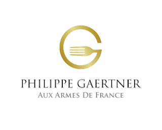
For example, just by looking at the logo below (source: by ZaiZi) for Philippe,we came to conclusions like;
"He's a chef, restauranteur or food critic"
"His taste and product are refined, elegant and fancy"
"He's French and probably between 40 and 60 years old"
How did we conclude all that? We responded to the font style (more traditional/formal) and text, the colors, and shapes.

The following links show the steps 3 designers have taken to develop a logo. Notice that all of them start out by sketching...on paper. They don't hold back. Like I already said...editing comes later. For now, sketch and play around with any and every idea that comes to mind!
Our next steps are to sketch, a LOT, evaluate what we have, compare notes, and probably sketch some more. Then we'll be editing a bit to have a better sense of purpose and direction when we begin designing on the computer. We'll be working with Inkscape, a free vector graphics illustration program. It's almost as good as Adobe Illustrator, covering many of the same tools.

No comments:
Post a Comment